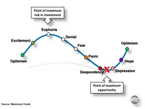
We have been asking this question hoping we were close to hitting bottom for the past three years. I wrote about it in 2009 and in 2011, I must have been too depressed to bring it up in 2010, lol. After doing several CMAs (Comparative Market Analysis) this week, I noticed in every pricing evaluation the graph had a curve similar to the one you are seeing here! Some neighborhoods seem to be higher than others, but most of the one’s I looked at were at the “Hope” to “Optimism” range, which is exactly how we are feeling in Denver.
If you were thinking of selling your home even just a year ago, send me an email or give me a call and let’s evaluate your situation, I’m feeling confident you will be pleasantly surprised.

